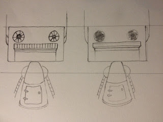
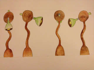
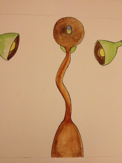
I picked 3 Images and fully developed them, One from each subject; Life from, Machine, and Structure
I carried on with more developmental drawings to give myself a feel for the image I was drawingI contemplated changing the costume of the robot I originally drew, into a British Redcoat costume
I also looked at other gun designs to see which one I was more comfortable with
I experimented a little bit with the alien, and gave him a body of a human dwarf
The Monkey, inside the aliens head was also fully realized in different angles like I did with the alien
I decided to remove the gun from the robots character completely
The lamp which I presented as turnaround image, didn't get any further developmental drawings because I felt that there wasn't more to the lamp, unlike the other two images.


Hi Akinbiyi, ...firstly, WELCOME! :) Just a quick general comment - when you are scanning your images in, try not get the centre fold of the sketchbook in etc. For example, the 2nd to last image above looks a lot more professional than the final one. Also, your font is tiny!! I know my eyes are getting n a bit, but I am struggling to read it! Good luck and enjoy the next 3 years :)
ReplyDeleteThank you, I actually didn't scan the images...I was going to, but the pages were too big, I took pictures instead and uploaded them, I see what mean though, I'll try and get that sorted out next time. Oh!! and do you have any advice on presenting my work, I'll have to present them on Friday, and...yeah I don't know where to start from :)
ReplyDeleteHello Akinbiyi, I'm Sammy and just starting year 2 of the course. I've been chosen as your mentor :) Anything you need to know or want advise on or tips etc. just contact me at samanthagracebutler@hotmail.com or at uni. I'll also be following your blog and commenting on your work so you'll always have feedback.
ReplyDeleteMy major tips for course survival are:
- Each unit comes with check list. Complete it in order and the creation of the final piece will be easy because you would have already done the work necessary to make it successful. You'll have all the research and the planning and have practiced the technical skills so you'll be confident when it comes to the final swing.
- Remember your an artist. Be creative with each unit! If you feel you need to sew a character's costume to get it right or make a set out of play-dough just go with it and make sure to blog it. If it will help you to creatively get the best result then it's never wrong!
- Blog everything and keep professional. Your peers and tutors will be following your work but they can only comment on what they see. Don't be afraid of negative feedback because there's no such thing. If something doesn't work in a midpoint stage it won't work in a final either and it's best you know asap. Your on a time scale with each unit so there's no time to be precious about work (something I'll admit I have a problem with). Comments will only ever be constructive and are essential to your unit's development.
Ok well that's the 3 key points. Sorry there's a lot to read there but I hope you find it helpful. Good luck on friday and I hope to see you soon.
Now feedback :) As Jackie said try to get each image as perfect as possible. Everything you post represents you as an artist and your work. Work on smaller paper so you can scan or your Photoshop to neaten it up.
ReplyDeleteAs for presenting your work PowerPoint Presentations are the norm. You don't need lots of writing just titles and the images. Start with the beginning of your process so when presenting you can show people where you started. Then move on to the next stages and finish with your final 3 drawings. This way your final pieces are built up to and your audience can see how you got there. Mostly it's you talking about your work so it's really easy. I'd say keep it under 20 slides (as an absolute max). There's nothing worse then seeing 1/57 appear at the bottom and any client would feel the same. Another tip is to NOT to use the pre-set templates for design, simple black will do. People are looking at your work and crazy colours do take from it. There are ways to personalize but be subtle. Have a look on here http://www.scribd.com/doc/83410538/Unit-4-Art-of-Presentation This is my unit 4 so I have branding and so on but everything is blank so I can focus my audience on the work.
I hope that helps... long winded again sorry :)
Thanks for that, it gives me a lot to think about; but about the presentation, I did my work on A1 and A2 size sheets, would it be wrong to have those images I did on the sketch pads on a stand and just talk about them as I flip through the pages? or should I have them as well as the PowerPoint in my presentation?
ReplyDeleteUsually in a crit you would present from your blog. That is you would upload your power-point onto your blog and show your work from there(this is done by saving it as a PDF and uploading onto scripd then embedding on a blog post. Don't worry this won't be expected of you for Friday! Just a simple USB with the file on it will be fine.)
ReplyDeleteThe problem with bringing in the sketch pad and presenting off the pages is that anyone at the back can't see your work and pencil is hard to see from even the front. Just get some good lighting and take some straight on pictures. If you don't have Photoshop yet you can use Paint to erase the page folds and for tidying up. :) hope that helps
Yes it does, thank you :)
ReplyDeleteFollow this to connect your laptop to eduroam:
ReplyDeletehttp://community.ucreative.ac.uk/index.cfm?articleid=25217