Saturday, March 29, 2014
Friday, March 21, 2014
Adaptation Part B - Modelling Progress
This is my progress so far, I still need to fix his face, and add details on the Torso and Trouser, since my character isn't highly detailed and I'm modelling/texturing him in a similar style of the Walking Dead Tell Tale game, there wouldn't be alot of details sculpted on
Head
Hair
Shoe (Topogun Test)
I plan to have a high res model of my character with little details like wrinkles in his shirt and trouser, his eyes brows....then use Topogun to retopologize the mesh, UV it then bake; normal, ambient, and diffuse maps on to it before rigging the character
Head
this was the base mesh I finished
I moved on to Zbrush, but decided to stick with Mudbox, because I wouldn't need alot of detail in his face
...still working on a High res model
it this doesn't work out I could still use nHair, or model his hair using plains with a texture imported as png with a transparent background
Torso
I did play around with the idea of having his butt area complete spherical but I decided against it...
Shoe (Topogun Test)
I used the shoe to quickly run through the pipeline briefly...but I did run into an issue when I went into xNormals, because I wasn't really paying much attention when I was drawing on the polygons, my mesh had an N-sided face, which meant I couldn't bake anything
Wednesday, March 12, 2014
Tuesday, March 11, 2014
Robert Neville Orthogrphics
Wednesday, March 5, 2014
Adaptation Part B - Update
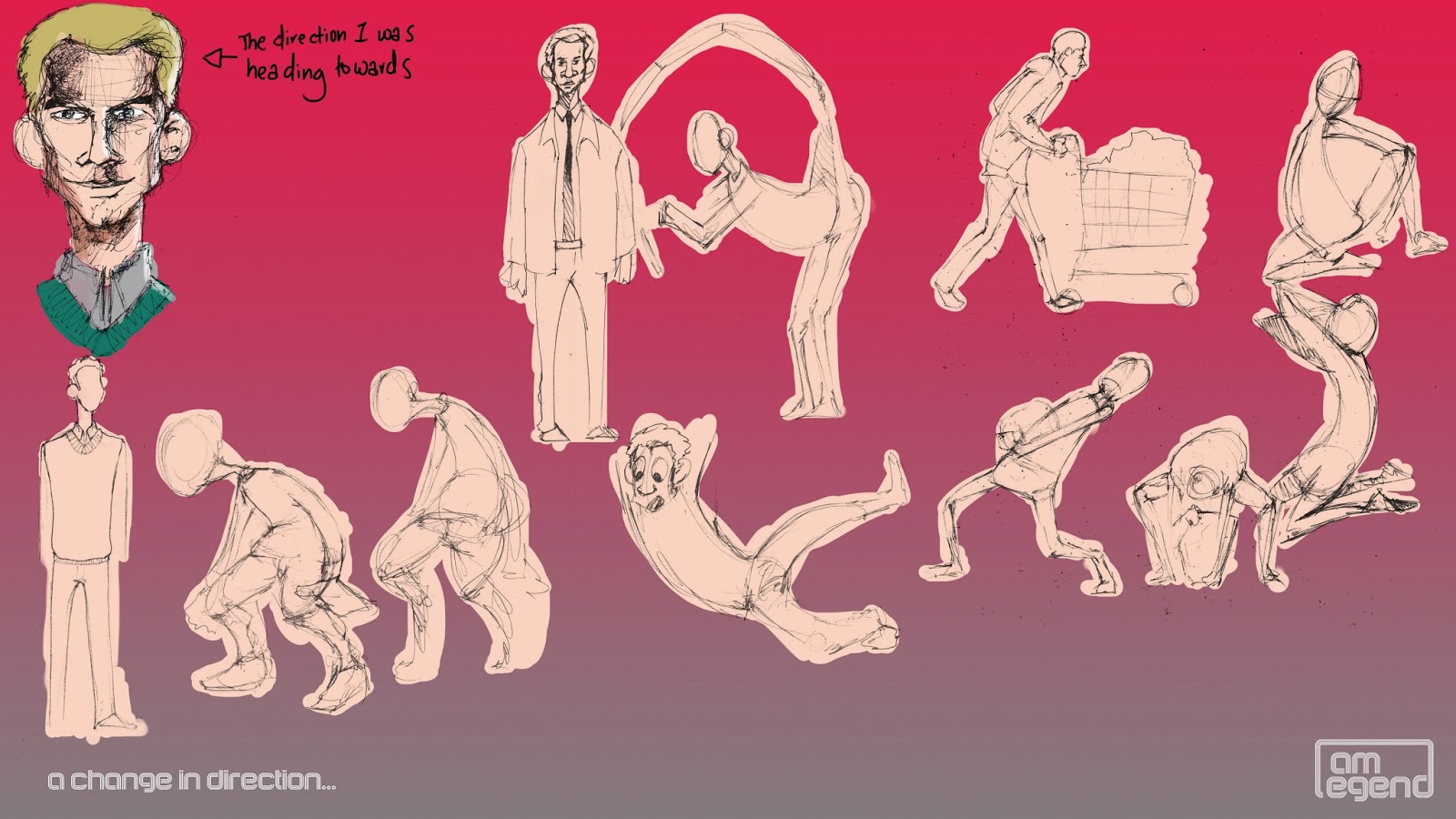
After my tutorial I had to go back and rethink the tonality of the whole character and understand what type of game it would be, it became clear to me that I needed a change in direction as I began to get frustrated with designing him, instead of trying to force a design out I stripped a few things back and stuck to have a comedic take on the Character. Apart from Charlton Heston's take on Robert Neville, past reincarnations of Robert Neville were quiet serious, and had the lone wolf type archetype going for them, I wanted my adaptation to be different, someone funny to watch and the most unsuspecting hero, I imagine him being permanently Clark Kent, the clumsy goofy guy in the office that wouldn't hurt a fly.
...In terms of style, i liked the cartoony exaggerated look but in terms of 3D, I imagine an outcome similar to games like Tell Tales the Walking Dead.
The drawing on the top left was as far as I got before I hit a wall...I decided to change the tone and strip a lot of baggage and go for a more comedic approach.
I decided to use a mixture of Ben Stiller and James Stewart to embody the role of Robert Neville, I like James Stewart's height and overall presence but Bent Stiller's face was jumped out as a lot more interesting to me.
...here I was using silhouette's to test more much I could stretch the character how cartoony or realistic would he be. on the left I have to silhouette's because I was playing around with the character's journey.....maybe he could go from goofball to hero, but I decided stick to leaving him as a the clumsy awkward hero, again trying not to tack on elements which could end up confusing things.
After settling on a tone and the change of direction this is where I'm at with the character...
Subscribe to:
Comments (Atom)


